
Give the first screen one unforgettable idea
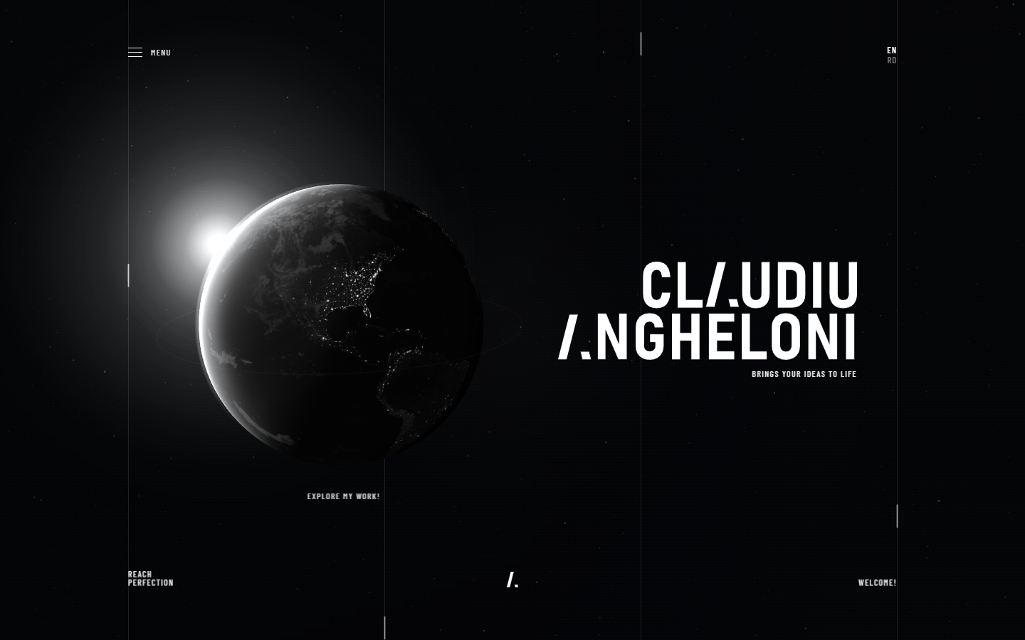
The home page had to behave like a poster with depth: globe, stars, wordmark and minimal UI working as one composition.
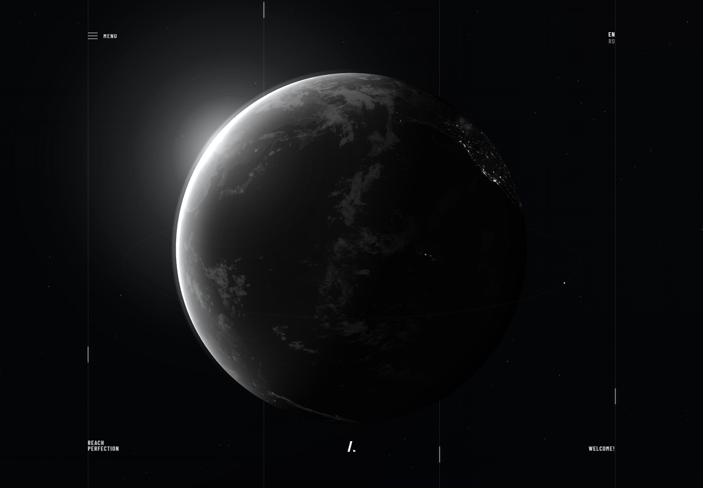
A personal portfolio rebuilt as a presentation system: globe-led navigation, bilingual routing, modular content and a case-study structure designed to scale without losing atmosphere.
The home page had to behave like a poster with depth: globe, stars, wordmark and minimal UI working as one composition.
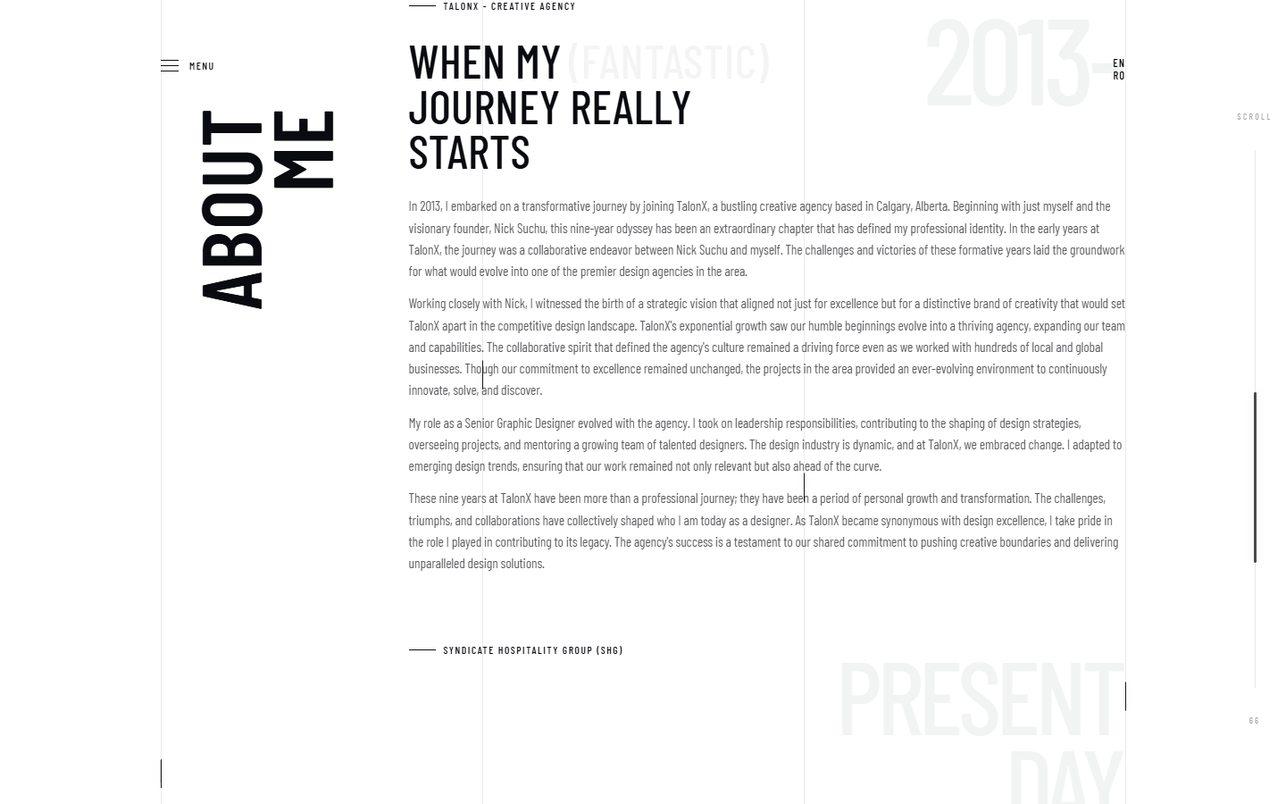
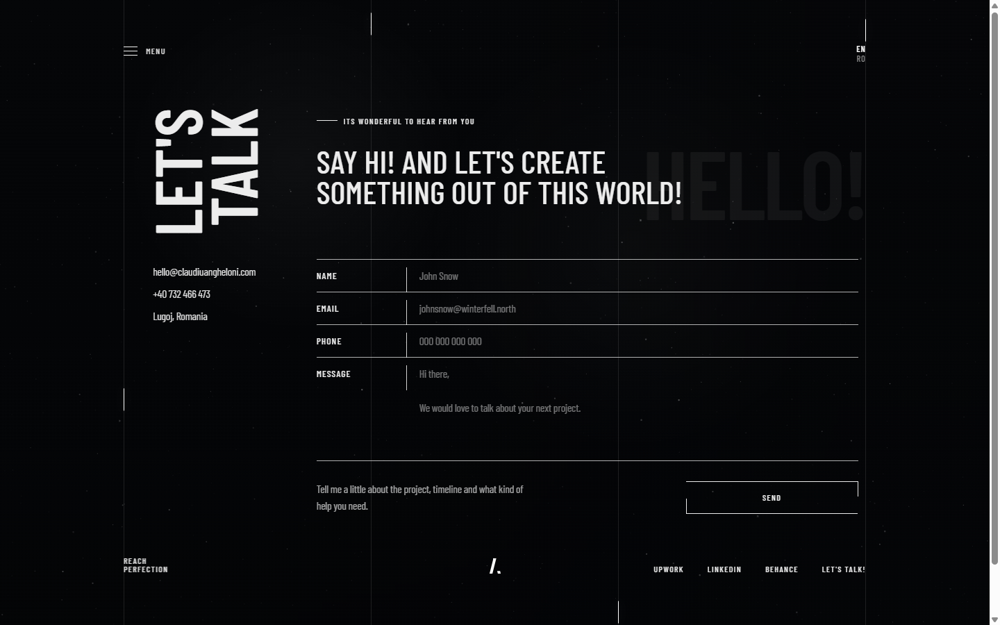
About, contact and project pages shift tone, but stay tied together through typography, pacing, grids and controlled motion.
The site needed a content layer that could absorb future projects without rebuilding templates or weakening the visual direction.
Each surface handles a different job: home as poster, about as editorial rhythm, contact as interaction desk and project pages as proof structure.
A stronger first impression built around one visual thesis instead of a generic portfolio layout.
A modular frontend shell that can grow into more case studies without collapsing into one-off pages.
A clearer bridge between visual identity, interaction design and the actual proof of work.